


BANNERS 8 SPOT CAMPAIGN

PUBLISHERS AROUND THE WORLD

COUNTRIES

LANGUAGES

DAYS TO DELIVER
Utilizing best-in-class team members from a variety of disciplines, Venuiti succeeded in delivering all components of the program on time. Further, Venuiti saved Chubb money using its patented banner creative engine to support the heavy production requirements of the program.


In September 2017, we took on a project to implement a comprehensive production and delivery program for Chubb Insurance. This program was global in reach covering countries from the United States, to France, to China.
We were brought in based upon our nimble response times for complex production and expertise in a variety of specialties which global implementations of this magnitude required. We were also brought in because we’re known for completing the impossible on seemingly impossible deadlines.
However, nimble doesn’t just mean get it done fast. It was important that every step we took, everything we did maintained the creative vision Chubb expected for it’s program.
At Venuiti, we believe that the first step in tackling a problem is understanding it fully. With this in mind, we pored over the data we were given and deconstructed the deliverables step-by-step until we had perfect clarity of the tasks at hand.
The campaign spanned 8 real-life stories about how Chubb performs for its customers.

Aside from substantiating the storyline, and translating the concepts into the languages required, we had to establish a comprehensive management systems to traffic TV, Banners, and OOH to the variety of places they needed to be around the world.
We also had to work with a unique color palate, an extensive variety of file formats, size requirements and more. Creating from scratch threatened to take too long.


We live for due diligence. No matter what the project. It’s the hallmark of how we find ways to reinvent. Even just for production. We researched how other companies might approach this assignment finding 2 expected directions: expensive teams of Jr. developers or cookie-cutter tools.
It was obvious to us that finances aside, a slew of Jr. developers would work independent of each other – creating inconsistencies, slow downs, and potential cost overruns. Standardization was key.
The second option, using a templated solution, allows for a more standardized campaign but severely limited the banners creatively.
Easy to edit
Lack of customizability
Only solves part of the problem
Lack of support
Ability to customize
Time consuming
Potential quality issues
Inconsistent
At Venuiti, we live and breathe reinvention.
And it’s that very belief that led us to the decision that we had to be different from everyone else. Within the timeframe we had, we built and implemented an entirely new, reusable system for Chubb. To do so, we used our deep experience in technology and development to create, and optimize a proprietary tool that would elevate the process and increase efficiency. We spoke with industry experts and gathered all the key features required of a creative process like this. We identified the objectives and simplified the workload without risking quality.
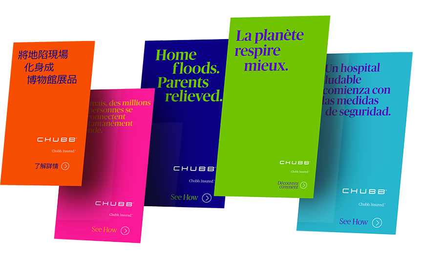


Digital and OOH creation
We identified that there were less than 100 unique sizes of banners; and of these hundred, 15 sizes made up over 80% of the units.
We meticulously crafted the code for these various creative elements, ensuring that it was as clean and malleable as possible. We reduced the file size to the absolute minimum so that it would work for all markets and in all file formats.
These would be our prototypes, going forward. With these in hand, we began work on a customized software solution.


We envisioned a twofold outcome
Something that would tackle both creation AND review processes. In-house, we began to simply call it ‘the tool”, because like a swiss-army knife it would have everything we needed, all in one.
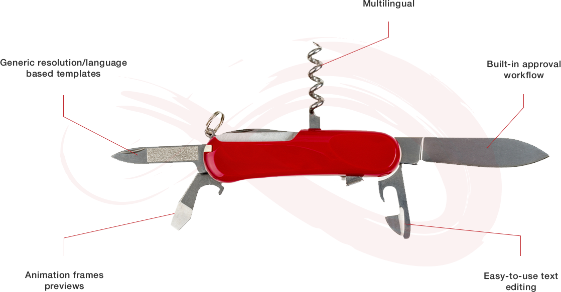

We devised a solution through which any user could enter text onto the banner or OOH unit, the same way they would enter it in a word processor.


We created an engine through which all the different creative unit resolutions could be displayed on the page. We knew the color palette of each story and coded these into the finished units.
By this point, we had the layout, colors, and the ability to enter in text. All that was needed now was to match up the indentation to the campaign flow.
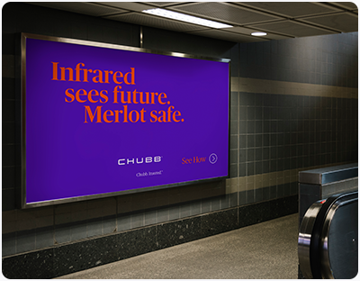

Rather than enter the copy for each unit and building to the flow, we devised a more elegant solution. We created an aspect ratio selector through which the user could enter copy for one unit and have it dynamically scale and fit each unit of the same dimensions, e.g. all long and thin banners.
At this stage, we had the procedure to generate the creative, but we still needed to display the information that went with each unit. This information included things like where the unit was to be published, and when.
Our team took the spreadsheets provided by the client, and set-up the system so that at a click of a button, the unit would be downloaded along with a sheet displaying this information. Through the tool, even non-technical users could create a customized unit within minutes.


However, as with any campaign, we knew the creative would require feedback from the client.


We created a sophisticated yet elegant solution with an interface where the client could view the creative – along with all the relevant information. Our team members would be able to create the units and then display them through this interface.
However, a list of thousands of creative units wouldn’t have been very helpful. That’s why we introduced filters on this interface. We could generate a link for the client which only showed them the units they needed to see at any given time.


We also introduced a ‘unique resolutions’ filter. This meant that if there were multiple copies of a creative unit with the same size and copy (and which varied only through placement or publisher) then this would only show up once for the client to review. That way we were able to save our client’s time, vs. having to look at the same creative unit by country.


Since we were reinventing efficiency, it became obvious to us that we had to reinvent communication of approvals too. We added functionality that enabled the clients to input comments right beside each creative unit being evaluated.
We could make the changes they requested and the creative would be updated for them to look at again. Once they were happy, they were able to click an approve button which would remove the creative unit from their priority list for review, eliminating any chance for confusion of versions.
Once all the creative for a particular country were approved, we would release them through the tool, hassle-free.
Constant Reinvention
Constant Reinvention
We use internal review to ensure we’re always reinventing ourselves too. Throughout this program, we re-evaluated and optimized the tools we created.
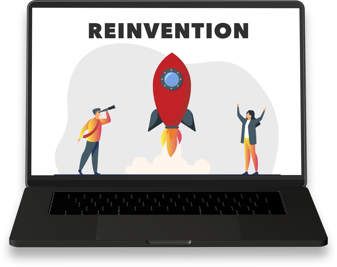


Set the margins for all banners of a certain resolution in a central location.


Add new banner resolutions and information to the system with ease.


Increase banner-specific elements such as font size and spacing.
